Canceling Accessibility Camp DC for October 11, 2014

After much thought and discussion, we are canceling Accessibility Camp DC on October 11, 2014.

We hope this does not cause too many people grief because they have already booked airfare and hotels to attend the event. I notified those I knew who were attending from out of town that we might have to cancel the event.

For those still coming to DC because you purchased airfare and hotel, we can still get together and talk abut accessibility. We could even have a wine and cheese tasting at my house, along with sightseeing if you want too.

A big thanks to our sponsors. I will look into the fastest way to get you your money back. It might take a bit with EventBrite, but I will figure something out.

Thanks for all those that did register and planned on attending camp.

We are looking into the possibility of re-scheduling the event for a later date. Most likely, the event will be in January or February of 2015.

Simple Accessibility Updates to Improve New York Times New Redesign – Part 2

For those following along, this is Part 2 of my series on how the New York Times can make simple updates to improve their website’s accessibility. “Part 1 – Simple Accessibility Updates to Improve New York Times New Redesign” is available for those who missed reading it.

Reminder: I’ve written these posts to help to the New York Times, along with anyone with large websites, or those who are designers or developers, etc., to show that simple incremental changes can improve their website in the long run.

In this post, I will cover the following accessibility issues with the New York Times home page:

  • Missing skip navigation
  • Difficultly seeing visual cues for those only using the keyboard
  • Poor color contrast
  • Not able to use video player by keyboard only
  • No captioned videos for individuals that are deaf or hard-of-hearing

Adding Skip Navigation

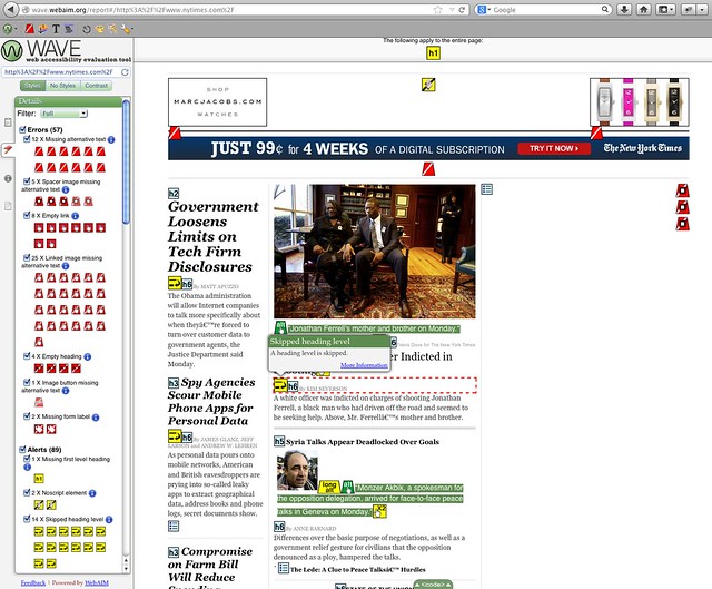
Skip navigation allows people that use a keyboard or assistive technologies like screens reader JAWS, NVDA, VoiceOver, etc.) to bypass large sets of links and focus on the content. Unfortunately, the New York Times pages are missing skip navigation, which means that screen reader users must listen to all of the preceding content before getting to the main articles.

Adding skip navigation to your pages is fairly easy as shown in this article on my blog called “Are You Using Skip Navigation?”.

You can choose between a few different techniques to hide your skip navigation depending on what your design team or marketing department want. Here are a few articles about skip navigation:

Note: These websites have additional accessibility articles you might want to read when you have the time.

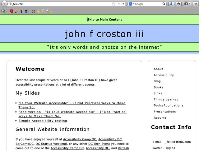
An example of skip navigation can be found on my main website (press TAB to see the “Skip to Main Content” link at the top of the page). I haven’t yet updated my blog’s WordPress theme to include skip navigation.

Visible 'Skip to Main Content' link on jfciii.com website

Thinking About Color Deficiency (Colorblindness)

Approximately 8% of the population (mostly male) has one of the three main types of colorblindness (deuteranopia, protanopia, and tritanopia). This, along with small text, might make it difficult to read parts of the New York Times homepage.

The following examples demonstrate what people with normal vision see as compared to the three main types of colorblindness:

The opinion page section with now colorblindness mask added

Normal vision

Deuteranope colorblindness mask added to the opinion page section

Deuteranope (a form of red/green color deficit)

Protanope colorblindness mask added to the opinion page section

Protanope (another form of red/green color deficit)

Tritanope colorblindness mask added to the opinion page section

Tritanope (a blue/yellow deficit- very rare)

To help people who are colorblind, the New York Times needs to verify the color contrast ratios.

Analyzing Color Contrast

For those who have low vision, poor eyesight, or colorblindness, some of the text on the New York Times home page could be difficult to read. An example would be the bylines to their articles.

New York Times feature article bylines

Bylines from New York Times feature articles on home page

If you were to use one of the many check color contrast tools, such as Jonathan Snook’s “Colour Contrast Checker” you input the foreground (font/text) color and the background color to see if it passes WCAG 2.0 standards:

  • Level AA: contrast ratio of 4.5:1 for normal text and 3:1 for large text
  • Level AAA: contrast ratio of 7:1 for normal text and 4.5:1 for large text

You can be get the hexadecimal numbers from Photoshop (designers), or by right clicking the text and having the Firefox plug-in FireBug (developers). In this case the CSS is:

.NYT5Style .byline { color: #808080; font-size: 10px; line-height: 12px; margin: 4px 0 2px; }

The screenshot shows the Colour Contrast Checker after I added the CSS from one of the home page bylines. As you can see, the foreground color #808080 is a light gray, which has inadequate color contrast on a white background with a ratio of 3.95.

New York Times poor byline color contrast show on Jonathan Snooks colour contrast tool
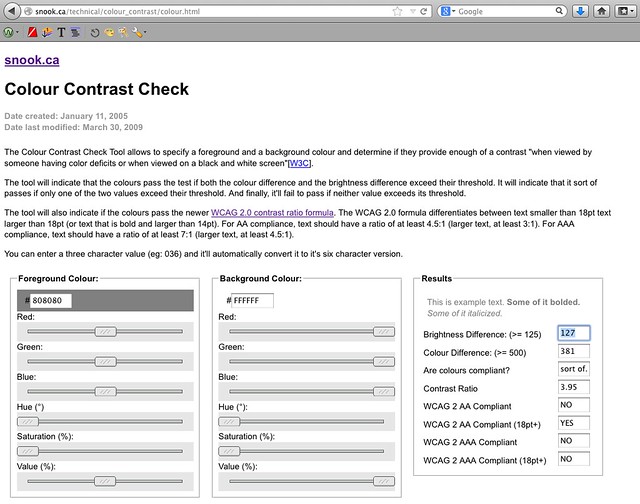
Another reason it might be difficult for others to read the byline is because the font size is only ten pixels (10px). I recommend that the font size be no smaller than 12 to 14 pixels (12px to 14px) depending on font choice. The font Arial at 12 pixels (12px) is smaller than Helvetica at 12 pixels (12px).

Some of the more popular color contrast checkers/resources are:

Providing Visual Cues for Keyboard-only Users

It is difficult to see where you are (that is, which links are active) when tabbing through the home page. One way the New York Times can fix this is by adding “:active” (IE browsers) and “:focus” (for all other browsers) in the CSS to the elements that include “:hover.” Then, when you tab, the links are indicated (in this example, with an underline).

Here are the current and updated examples of the CSS:

Current CSS

a:hover { text-decoration: underline }

Updated CSS

a:hover, a:focus, a:active { text-decoration: underline }

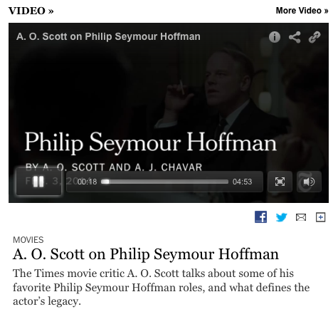
Making the Video Player Keyboard Accessible

Keyboard-only users cannot play, pause, enlarge the video to fill the entire screen, or change the volume.

A friend who works in the accessibility field asked if I knew of any way to make a YouTube player keyboard accessible for a .gov website he and his team were working on. I told him how Derek Featherstone and his team had used YouTube’s API to create their own links to play, pause, etc. the video by using JavaScript and CSS to place the links over the inaccessible ones. Due to time constraints, my friend and his teammates added an additional set of controls below the video, which did the trick of making the video player accessible.

Captioning Videos

I looked at several videos on the home page, and none of them had captioning. Lack of captions can make following, along with the video difficult for those that are deaf or hard-of-hearing .

Solve this problem by getting the videos captioned. Many services are available that will caption your videos for a price. The quality of the captioning somewhat depends on how much money you have to spend.

No captions for this video and no ability to turn them on if they were available

No captions available

Another solution is to take a transcript, if available and use captioning software that will split the text/captions at the correct places.

Conclusion

So this concludes Part 2 of my series on “Simple Accessibility Updates to Improve the New York Times New Redesign”. The next blog post will be about the accessibility issues found on the article pages, which I’m guessing will have similar issues as the home page does, and finally how to use all the tools I used.

I hope this post helps you find easy ways to check your websites quickly for accessibility issues, along with pointing out a few free tools you can use.

If you have other tools or software that you use to check website accessibility, please add them in the comments, because not all tools will find all the issues.

References

Screen Readers

Skip Navigation Articles

You can find more great accessibility articles on both of these websites.

Color Contrast Tools

Edited by: Char James-Tanny of JTF Associates, Inc.@CharJTF

Simple Accessibility Updates to Improve New York Times New Redesign – Part 1

From the promo piece I saw about the New York Times new redesign, everything looked really good, and I was looking forward to seeing it.

New York Times Redesign Goes Live

On Wednesday (January 8, 2014), the new New York Times redesign went live, and everyone was raving how lovely it was from a design, content, and responsive web design perspective. No one was talking about how accessible the new redesign was. On Wednesday morning, I saw Patrick Dunphy’s tweet: “redesigned http://nytimes.com homepage #accessibility quick check w/@WebAIM tools web 59 & toolbar 131 errors #a11y” I’m familiar with the WAVE Toolbar by WebAIM, which is useful for testing behind firewalls or for code found on DEV servers. It’s a free Firefox plug-in and WebAIM’s online checker is useful as well. After seeing that Patrick had run the home page through the WAVE tools, I had to do the same thing myself. And I found that the New York Times had missed a lot of what I thought were easy items, such as missing ALT text, empty or missing headings, missing form LABELs, etc. I was able to confirm Patrick’s findings. On Saturday evening at about 6:30 PM EST with the WebAIM WAVE toolbar, I found 115 errors. The following screenshot shows the results. Some of the problems that the tool identified are:

  • Missing ALT text – red background with white line running through it diagonally
  • Linked image missing ALT text – white hand on the red background
  • Empty heading – an “H” with a question mark on a red background

All screenshots can be enlarged by clicking the images and they were re-taken on January, 27, 2014.WebAIM WAVE toolbar with 115 errors Next, I used the WAVE WebAIM accessibility checker and I found 57 errors and 89 warnings. The following screenshot shows the problems that the tool identified:

Errors

  • Missing ALT text – red background with white line running through it diagonally
  • Linked image missing ALT text – white hand on the red background
  • Empty heading – an H with a question mark (h?) on a red background
  • Missing FORM LABEL – white gift tag on red background
  • Image button missing ALT text

Warnings

  • Missing first level heading – yellow background with an “H1”
  • Noscript element – paper scroll on yellow background
  • Long ALT text – the word “long ALT” on yellow background

WebAIM WAVE accessibility checker showing 57 errors and 89 warnings Around 2 PM EST Wednesday afternoon, I saw Jeffrey Zeldman’s tweet: “NYTimes redesign has finally gone public. http://www.nytimes.com/redesign/ Content-first, responsive, immersive.” I replied: “hopefully accessibility next? Missing easy stuff? MT @zeldman NYTimes redesign has finally gone public. Content-first, responsive, immersive” And Jeffrey answered: “@jfc3 Can you write a post about the easy things, accessibility-wise, that the otherwise wonderful @nytimes redesign is missing?” So I responded: “sure @zeldman I can write up a blog post over weekend about the easy accessibility updates the new @nytimes redesign should have done. #a11y

Writing an Accessibility Review

My conversation with Jeffrey is why I wrote this blog post after checking the New York Times new redesign for simple accessibility issues. I understand that not all of the home page may have been updated, or parts of the page are being created somewhere else or that they have a bunch of technical debt they have to deal with. I’m trying to use this large public project to show people that, in the real world not everything gets done before you go live. But you still can work on accessibility at any time with some easy-to-use free tools that will get your website or web application closer to being accessible to all. After you fix the issues found with the free tools, you start to worry about using assistive technologies like screen readers (JAWS, NDVA, VoiceOver, etc.), talk-to-type (Dragon Naturally Speaking), text enlargers (ZoomText), etc.

Possible Solutions

The New York Times can make some simple changes to the home page and article pages (future blog post) to make them more accessible to those using assistive technologies or those who only use the keyboard.

Missing ALT Text

Let’s start with the missing ALT text, which seems to be common in certain sections of the home page, but not in others. If you go to the “Inside NYTimes.com” section, they use the article title as the ALT text, a technique I used to have our developers use for images that link to articles on ARMY.MIL. Missing ALT text for the previous or next buttons in the “Inside NYTimes.com” section In the “Inside NYTimes.com” section, there are no ALT text for the previous or next buttons, which you would think would be useful for those trying to see other items currently listed off screen. When you go to the sections shown below, which are the World, Business Day, Opinion, Technology, etc., there is no ALT text. Look for the white hand on the red background to see which linked images are missing ALT text. Missing ALT text for the images that link to the articles Here is another section (“The Opinion Pages”) of the home page that is missing ALT text, which are links to the articles. Opinion page section with empty ALT text for images that link to same place as the heading level five’s (h5) I’m not sure why they didn’t make the ALT text be the article title as they did in “Inside NYTimes.com” section for the “World, Business Day, Opinion, Technology, etc.” section and the “The Opinion Pages” section.

Empty or Missing Headings Levels

After running both WebAIM tools (WAVE toolbar and online checker), I noticed that the home page had a bunch of headings that were empty. Most of the time, that was because they had created the same heading level just before or after the empty one. Under the main featured article, there is an empty heading level six (H6), which is followed by a heading level five (H5), and then another heading level six (H6). Why not remove the empty heading level six (H6), because it’s making it more difficult for those using screen readers, etc. to understand the page structure and find things on the page? Under the “Arts” section (as mentioned by Sarah Bourne), there is a heading level four (H4), and then there is an empty heading level six (H6) followed by a heading level five (H5). This shows issues with headings because one is empty and another that it is not in proper order, because it goes from H4 to H6 to H5. Empty heading level six (H6) under feature article and incorrect heading order under “Business Day section”

Missing Form LABELs

When you look under the “Auto” and Jobs” tabs of the home page, there are form INPUT fields with missing LABELs. Another interesting part of this is that the text above the INPUT fields is outside the FORM itself. Missing LABELS in Auto Section of New York Times Home Page   The New York Times newly redesigned home page still has some other issues: possible color contrast problems, buttons that are not real buttons (as mentioned by Ian Pouncey), issues with using the keyboard, and screen readers that can’t figure out where a person is on the screen, etc.

Conclusion

I’m going to break this topic into multiple parts. I plan to write about the other accessibility issues found on the home page, about the article pages, which I’m guessing will have similar issues as the home page does, and finally how to use all the tools I used. I hope this post helps you find easy ways to check your websites quickly for accessibility issues, along with pointing out a few free tools you can use. If you have other tools or software that you use to check website accessibility, please add them in the comments, because not all tools will find all the issues.

References

WebAIM

Edited by: Char James-Tanny of JTF Associates, Inc.@CharJTF

2014 = FOCUS

No, New Year’s resolutions for this guy, but this year’s theme will be “FOCUS”. Themes is an idea, which was taken from Jared Goralnick’s blog posts from a few years ago:

Instead of doing New Year’s resolutions, which I haven’t done in decades I’m going to spend an extra five hours a week minim, hopefully at least ten hours, a week on a given subject for a month or more depending on the amount of knowledge gathering needed for a given subject. More time will be spent each week if my schedule happens to allow for more, but at least five hours a week, which will make over 250 extra hours of training over the course of the year. The week will start on Monday and ending Sunday night, which allows me the opportunity to either catch-up on the weekends of add more hours for that week.

Plan for Spending My Time

I will spend the first two to three hours per month writing down more details of what and how I’m going to spend my time learning that month. The months focus maybe to spend the next five or ten hours reading blog posts, books, etc. on a given subject before diving in to learn and work on a given subject. Or it might be to spend an hours reading a book, blog post or whatever and then another hour or to doing something like coding or painting.

Will also need to spend and extra hour or two towards the end of each month contacting people that are smart and know more about a given subject for recommendations on what to read and anything else I will need to stay focused on the next month’s subject. This time spent asking questions, for help, or recommendations will not be part of the hours each week/month focusing on a given subject.

I want to spend at least four full weeks on the subject. If the month starts or ends somewhere in the middle of the week, I will need to decide if I have learned enough or if I should spend and extra day or so continuing to learn or move on to the next subject/area of focus.

Topics of FOCUS

A lot of the topics I’m going to be focusing on for one month will hopefully help prepare me for the next month and be able to be improved upon and use this whole time. By the time, I get into the months of August and September (PHP), October and November (mySQL), and finally December these focus areas are going to get me closer to finishing my web based event registration application Hold An Event or at least build something a little less complicated, so I have some kind of finished project by the end of 2014.

Below are the months and what subject I plan on focusing on during a given amount of time. Some subjects span a few months because I have determined that to learn anything useful I will need to focus on them for a longer amount of time. Under each month/topic of focus is a list of things I can think of now that I want to focus on with more to be added at the beginning of each month or as I delve deeper into a subject.

January – Improve My Writing

  • Start with doing a bunch of reading on how to improve my writing and grammar.
  • Create outlines for some writing examples.
  • Next will be outlines of blog posts, slide presentations, etc.
  • Write short blog posts or stories to get more practice in .
  • Write Hold An Event content from the perspective of first time user/visitor to website/application.

February – Creativity, Inspiration, and Passion

  • Read about how to be more creativity, inspired, and passionate.
  • On the weekend or weekday night take a trip to the National Gallery or Art.
  • Take a bus road trip to NYC to visit MoMA or one of the other museums.
  • Spend time painting.
  • Watch YouTube videos to learn how to play the guitar.
  • Take a guitar lesson or two.
  • Do some sketching on iPad using Paper from 53 of new “I Gotta Eat Here” web application.

March – Learn Git, along with Github

  • Learn Git.
  • Learn Github.
  • Practice starting with:
    • Improving my website content.
    • Update blog posts for grammar and spelling issues.
    • HTML code, JavaScript, CSS, etc:
      • Improve or remove obsolete code.
      • Delete commented out code.
      • Make pages responsive.
  • Add META data to web pages.
  • Continue to improve my writing by re-writing website content for:
  • Accessibility improvements need to be made in the process of learning Git.

April – Learn More about Accessibility

  • Some subjects include ARIA, JAWS, Dragon Naturally Speaking, VoiceOver, etc.
  • Use accessibility information gained at CSUN to start working on being a better developer.
  • Focus on improving my knowledge about ARIA/accessibility issues the better I will be at building websites, web applications, and making JavaScript/jQuery items more accessible.

May – Better Health

Originally had this January as everyone does to start the year out on the right foot and decided, since that usually doesn’t work, why not try it later on. This allows me to focus on other subjects during the colder months and start with health once ti gets warmer, since I tend to like to walk as my exercise.

  • Starting with food (better choices, smaller portions, etc.).
  • Exercise more by walking after work and on weekends.
  • Work on having more energy to be able to stay up late to work on Hold An Event later on down the road and still feel rested.
  • Create easy ways to cook and prepare healthy meals.
  • Decide how many days during given a week I should cook/prepare my own meals.
  • Decide how to have me to bring my own healthy food to work for lunch, which saves me money.

June and July – Javascript/jQuery

  • Find best book(s), video tutorials, or blog posts to learn JavaScript.
  • Learn JavaScript and to start with the basics, maybe with Jeremy Keith’s book (DOM Scripting), if it’s still a good resource, which will make understanding and fixing jQuery issues easier.
  • Learn jQuery, since most websites now a days use it to perform their JavaScript functionality.
  • Create accessible examples, along with ARIA, error messages, etc. examples for others to use.

August and September – PHP

  • Learn the best way to optimize code.
  • Create ways to read different parts of the database by changing parms.
  • Create API to use to create, read, update, and delete records.

October and November – mySQL

  • Create databases.
  • Write new records.
  • Update/delete record (not really deleted, but mark as done using date so I will know when record was deleted).
  • Find the best way to optimize database to get information as quickly as possible.

December – Security

  • Stop denial of service.
  • Look into protecting data, but mostly user information.
  • Figure out how to add SSL to website, along with cost per year, etc.

In Conclusion

After each month, I will write a blog post to continue to improve my writing, along with explaining what books, blog posts, videos, etc. I read or watched to help me focus on that months subject. Will also rate myself on how I thought I did with a given subject and if I truly learned anything, long with to tell everyone how many hours I managed to focus on that months subject for.

So this year I plan to “FOCUS” on monthly topics and hope to be better and more knowledgeable person by the end of 2014.

What are you planning to accomplish in 2014?

How to Improve Your Search Usability

Doing searches on websites is a pain when you are using assistive technology. There are ways to improve how you get to the results.

Why not add an HREF anchor like #maincontent, which we used for the “Skip Navigation” article to your “Search Results URL” so those using screen readers, other assistive technologies, keyboards only, or other non desktop web browsers to skip right to the results section of the page skipping all the header, primary navigation links, and secondary navigation, etc.

You also need to make sure you have a LABEL connected to your search box for screen reader and other assistive technology users to know what they are looking at. Below is some sample code you can use as a starting point, along with some CSS to hide the search LABEL visually off screen if your design calls for that kind of things.

Search Form Code

<div class=”SEARCH“>
<form name=”Skills_Search” action=”searchResults.html#MAINCONTENT“>
<label for=”search2“>Search</label>
<input type=”text” name=”search2″ id=”search2” />
<input type=”submit” value=”Search” />
</form>
</div>

Results of Search Code


To hide the word “Search“ just add to the hide class used for the skip navigation blog post this can be done easily by adding “.search label” to the CSS.

Here’s a live example of the search box and search results example page.

Hope this little change to your website was helpful to you and it will make accessing the internet for those using assistive technologies better.

If you have any questions or ways to improve this, please leave a comment or get in touch with me.