
From the promo piece I saw about the New York Times new redesign, everything looked really good, and I was looking forward to seeing it.
New York Times Redesign Goes Live
On Wednesday (January 8, 2014), the new New York Times redesign went live, and everyone was raving how lovely it was from a design, content, and responsive web design perspective. No one was talking about how accessible the new redesign was. On Wednesday morning, I saw Patrick Dunphy’s tweet: “redesigned http://nytimes.com homepage #accessibility quick check w/@WebAIM tools web 59 & toolbar 131 errors #a11y” I’m familiar with the WAVE Toolbar by WebAIM, which is useful for testing behind firewalls or for code found on DEV servers. It’s a free Firefox plug-in and WebAIM’s online checker is useful as well. After seeing that Patrick had run the home page through the WAVE tools, I had to do the same thing myself. And I found that the New York Times had missed a lot of what I thought were easy items, such as missing ALT text, empty or missing headings, missing form LABELs, etc. I was able to confirm Patrick’s findings. On Saturday evening at about 6:30 PM EST with the WebAIM WAVE toolbar, I found 115 errors. The following screenshot shows the results. Some of the problems that the tool identified are:
- Missing ALT text – red background with white line running through it diagonally
- Linked image missing ALT text – white hand on the red background
- Empty heading – an “H” with a question mark on a red background
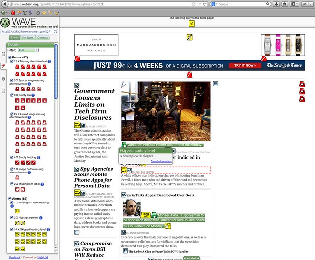
All screenshots can be enlarged by clicking the images and they were re-taken on January, 27, 2014.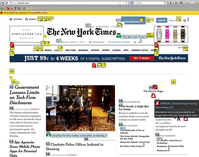 Next, I used the WAVE WebAIM accessibility checker and I found 57 errors and 89 warnings. The following screenshot shows the problems that the tool identified:
Errors
- Missing ALT text – red background with white line running through it diagonally
- Linked image missing ALT text – white hand on the red background
- Empty heading – an H with a question mark (h?) on a red background
- Missing FORM LABEL – white gift tag on red background
- Image button missing ALT text
Warnings
- Missing first level heading – yellow background with an “H1”
- Noscript element – paper scroll on yellow background
- Long ALT text – the word “long ALT” on yellow background
 Around 2 PM EST Wednesday afternoon, I saw Jeffrey Zeldman’s tweet: “NYTimes redesign has finally gone public. http://www.nytimes.com/redesign/ Content-first, responsive, immersive.” I replied: “hopefully accessibility next? Missing easy stuff? MT @zeldman NYTimes redesign has finally gone public. Content-first, responsive, immersive” And Jeffrey answered: “@jfc3 Can you write a post about the easy things, accessibility-wise, that the otherwise wonderful @nytimes redesign is missing?” So I responded: “sure @zeldman I can write up a blog post over weekend about the easy accessibility updates the new @nytimes redesign should have done. #a11y”
Writing an Accessibility Review
My conversation with Jeffrey is why I wrote this blog post after checking the New York Times new redesign for simple accessibility issues. I understand that not all of the home page may have been updated, or parts of the page are being created somewhere else or that they have a bunch of technical debt they have to deal with. I’m trying to use this large public project to show people that, in the real world not everything gets done before you go live. But you still can work on accessibility at any time with some easy-to-use free tools that will get your website or web application closer to being accessible to all. After you fix the issues found with the free tools, you start to worry about using assistive technologies like screen readers (JAWS, NDVA, VoiceOver, etc.), talk-to-type (Dragon Naturally Speaking), text enlargers (ZoomText), etc.
Possible Solutions
The New York Times can make some simple changes to the home page and article pages (future blog post) to make them more accessible to those using assistive technologies or those who only use the keyboard.
Missing ALT Text
Let’s start with the missing ALT text, which seems to be common in certain sections of the home page, but not in others. If you go to the “Inside NYTimes.com” section, they use the article title as the ALT text, a technique I used to have our developers use for images that link to articles on ARMY.MIL.  In the “Inside NYTimes.com” section, there are no ALT text for the previous or next buttons, which you would think would be useful for those trying to see other items currently listed off screen. When you go to the sections shown below, which are the World, Business Day, Opinion, Technology, etc., there is no ALT text. Look for the white hand on the red background to see which linked images are missing ALT text.
 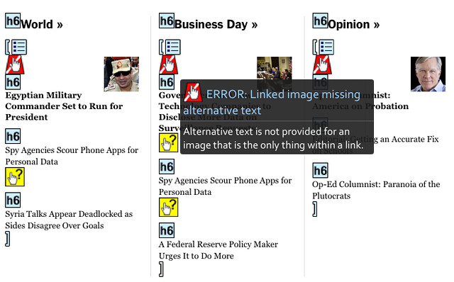 Here is another section (“The Opinion Pages”) of the home page that is missing ALT text, which are links to the articles.
 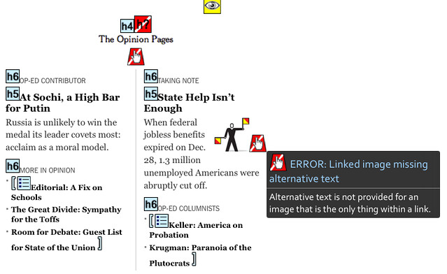 I’m not sure why they didn’t make the ALT text be the article title as they did in “Inside NYTimes.com” section for the “World, Business Day, Opinion, Technology, etc.” section and the “The Opinion Pages” section.
Empty or Missing Headings Levels
After running both WebAIM tools (WAVE toolbar and online checker), I noticed that the home page had a bunch of headings that were empty. Most of the time, that was because they had created the same heading level just before or after the empty one. Under the main featured article, there is an empty heading level six (H6), which is followed by a heading level five (H5), and then another heading level six (H6). Why not remove the empty heading level six (H6), because it’s making it more difficult for those using screen readers, etc. to understand the page structure and find things on the page? Under the “Arts” section (as mentioned by Sarah Bourne), there is a heading level four (H4), and then there is an empty heading level six (H6) followed by a heading level five (H5). This shows issues with headings because one is empty and another that it is not in proper order, because it goes from H4 to H6 to H5. 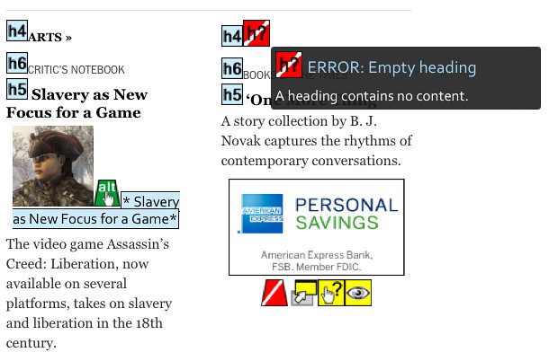
Missing Form LABELs
When you look under the “Auto” and Jobs” tabs of the home page, there are form INPUT fields with missing LABELs. Another interesting part of this is that the text above the INPUT fields is outside the FORM itself. 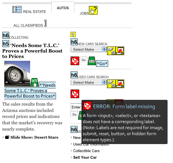 The New York Times newly redesigned home page still has some other issues: possible color contrast problems, buttons that are not real buttons (as mentioned by Ian Pouncey), issues with using the keyboard, and screen readers that can’t figure out where a person is on the screen, etc.
Conclusion
I’m going to break this topic into multiple parts. I plan to write about the other accessibility issues found on the home page, about the article pages, which I’m guessing will have similar issues as the home page does, and finally how to use all the tools I used. I hope this post helps you find easy ways to check your websites quickly for accessibility issues, along with pointing out a few free tools you can use. If you have other tools or software that you use to check website accessibility, please add them in the comments, because not all tools will find all the issues.
References
WebAIM
- WAVE toolbar
- WAVE Web Accessibility Tool – online checker
Edited by: Char James-Tanny of JTF Associates, Inc. – @CharJTF
For example, I recently used Ragg Mopp for a client who
produces child safety accessories. Some companies
are putting the knowledge of HTML 5 to the optimum use.
If you’ve ever played with color editing software that uses sliders for these elements,
you probably already understand them some.
my web blog; website design duncan ok
If the NYT introduces “native ads” ie ads embedded in editorial or news content
It intends to indicate them as such by subtle coloring according to a recent article in that paper.
How will native ads be recognized as such by a screen reader?
Khars,
Have not seen anything about “Native Ads” in articles, in the New York Times.
The only way a screen reader user might know there are ads in the middle of the article is if there was text before the ad saying so. Example text might be “Ad”, “Ads”, “Advertisement”, etc.
If they are only going to use a subtle color change to denote ads this could be an issue for those that have certain types of colorblindness, low vision, or issues with color contrast.
Hope this answer was helpful.
jfc iii
Pingback: Simple Accessibility Updates to Improve New York Times New Redesign – Part 2 | John F Croston III