Use of UL or OL in HTML Forms

I just finished re-reading Roger Johansson’s wonderful article entitled “Use the label element to make your HTML forms accessible“.

I agree with everything he said, except I think by putting the label and the input elements as part of an un-ordered list (UL) or an ordered list (OL) the screen reader will announce how many items are in the list. By doing so you can then place an UL or OL inside a FIELDSET, which will inform you of how many fields you need to be filled in. This number might be greater than the actual number of items if you have lines of text in the middle of the form field list.

I found this great piece of information about using UL or OL in forms from Justin Stockton when he was looking over a form I was building. He either asked “Why I was using the <BR> tag?” or “Why I had form elements inside of a <P> tag”. I told him that was how I learned to create my forms from articles I had read. He suggested using the UL or the OL for form items. After that, by like only a day or so I was listening to either one of Derek Featherstone, Aaron Gustafson, or boths podcasts about accessibile forms and they mentioned the same thing.

Here is a short  code example for filling out personal information on a form:

<fieldset>
<legend>Personal Information</legend>
<ul>
<li>
<label for=”first_name”>First Name</label>
<input type=”text” name=”first_name” id=”first_name” />
</li>
<li>
<label for=”last_name”>Last Name</label>
<input type=”text” name=”last_name” id=”last_name” />
</li>
<li>
<label for=”company”>Company</label>
<input type=”text” name=”company” id=”company” />
</li>
<li>
<label for=”title”>Title</label>
<input type=”text” name=”title” id=”title” />
</li>
</ul>
</fieldset>

Now here is what the code looks like as a form:

Personal Information


Of course you will need to use a bit of CSS to make this look better. You can remove such things as the fieldset border and do a bunch of other things to it. Here is the same example with CSS added, nothing fancy. When you use UL or OL in the fieldset you will be improving the accessibility of the form in my opinion.Please give me your thoughts on this matter of using UL or OL inside a fieldset.

A Few Quick Things About the OLPC

Yesterday I met Justin Thorp, Rodney DeGracia, Stewart, and Partica over at Murky Coffee in Arlington, VA with our One Laptop per Child machines (OLPCs). We had a good time talking about our new laptops. Stewart even mentioned that the OLPC he had brought with him was his daughters. He had purchased it for her and when he got to using it he like it so much that he did the Give 1 Get 1 again, before the dead line of December 31, 2007, so he could have one for himself.

We played the memorize game with each other over the mesh network. Justin and Stewart used the mesh network to collaborate on a document. It was fun watching Stewart type in his version of the document and then the changes happen on Justin’s in an instant.

There were three items that I had noticed before and wanted to re-test and look at with others there to make sure I was not imagining things.

The first thing was that if you have fixed width website that is greater than 800 pixels you will have to scroll your screen horizontally. The width might be slightly less than 800 pixels, I’m not sure the exact number. I know that my main website, which is 750 pixels wide fits in just fine. One of the OLPC websites does not fit on the screen has to be scrolled and I can’t remember which one right now. You would hope that their own website would fit on their machine. I figure they’re busy and have other things to do that are more important right now.

The second item was that when you fill out a form field or URL that you have done before it does not give you a list of what you have already typed before. This is not a big problem just a nuisance for someone that has used computers for years, but for someone that never has they will not know this information. It looks like the OLPC will let you save cookies, since I marked my Hotmail to remember me  on it and it did I will have to check this out more to make sure it is correct.

The final item and the one I find more interesting and troublesome is that if you have an application that puts up an alert box up it never comes up. I found this out by trying to delete a Twitter message that I had typed wrong on my Twitter account while using the OLPC. On Twitter when you request to delete a message it puts up an alert box that says “Sure you want to delete this update. There is NO undo!”. If you are using a normal machine it comes up fine and give you the option to hit “OK” or “Cancel”. Well when using the OLPC browser this message never came  up. You click the trash can to get the delete function to work and the little circle just spins for awhile, stops, and then nothing happens.

I know that most of the web forms and applications that I have built or maintain now have alert boxes that come up to show errors in the page, etc.. Time to test this out on a few other pages first to make sure I’m correct on this assumption. This could be a problem that makes it difficult for people with these machines to accomplish different tasks that include forms. This puts a barrier up and makes it an accessibility issue to those people using the OLPC. Hopefully it is only a temporary thing until they get it fixed. I know of a lot of web applications will show you a list of errors by putting them in an alert box. By using web standards for your websites I think you will keep away from problems that the OLPC can not handle.

Have any of you noticed either of these problems with your OLPCs or is there any other things I might have missed using my machine. This information would be helpful to me and others for when we are building web pages ad applications to make sure they work on as many devices as possible. If things go well there will be millions of these out in the world in a short time.

DC Adaptive Technology Meetup

I found another great meetup by using Ross Karchner‘s DC Tech Events website.

This one was the DC Adaptvie Technology meetup that was held at the DC Public Library in Washington, DC. The event was on Saturday December 1st, 2007, from 1:00 PM to 5:00 PM in room 215 at the Martin Luther King Jr. Memorial Library. The Saturday Technology Trainning sessions are usually for users of Adaptive Technology like the JAWS screenreader, the Zoomtext magnifier, and anything else that is technical and useful someone. They are usually held the first and third Saturdays of each month. No, meeting the third Saturday of December because of the holiday season. These meetings are normally run by Patrick Timony.

ICON PDA is a device that allows individulas with visual issues to listen to the web, podcasts, etc.

I was one of only a few sighted people at this meeting, which had about twelve or fifteen people. This meeting included a demonstration of the ICON accessible PDA, a braille reader, and how to use the new Mac OS (Leopard) for better accessibility given by David Poehlman.

David showed everyone how to use the ICON PDA by LevelStar. This device which is the size of an old style manual light meter allows people to use the following tools a calendar, an address book, a music player to listen to music or your favorite pod casts, allows you to take notes yourself with the voice recorder and journal, and stay on top of your world with a word processor, web browser, and email. This device has wifi/wireless and comes with a comprehensive menu of pre-installed applications , 30GB hard drive, and Bluetooth® built-in.

Next, he showed a braille reader that you plug into your computer or I even believe the ICON PDA. Finally, David demonstrated how you can have the new Mac OS be turned on to read everything out loud to you. I forget how he said you turn it on.

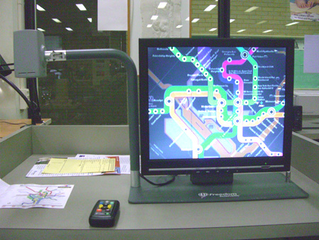
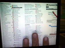
ONYX Desktop 17 inch Closed-Circiut TVAfter David got done Jerry Marindin of Freedom Scientific showed everyone how to use the new ONYX Desktop 17 (Closed-circuit television) CCTV. This device allows people with visual issues to magnify papers, books, maps, etc. It also comes in a model that does not have a camera, but plugs into your computer instead. With the remote control that comes with it you can zoom in or out on a document, flip the camera up to point at things in the back of the room and then zoom in on them. This would be great for people at meetings or classrooms that can not see distance. It also allows you to change the color of maps for those that are color blind. You can change the color contrast so if white text on a black background works better for you then you can do that.
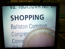
pageof text under ONYX CCTV device

I mentioned to Jerry during his presentation that the image under the camera was upside down and he said “I will show you later how to fix that”. He was then able to use the remote to flip the image on the screen to be flipped the proper way that you needed it. He mentioned that when he brought this producted to a meeting a while ago that one of the blind ladies mentioned that the remote when in audible mode said to push the “RED” button. She said what if I can’t see or if I’m color blind. Jerry took that information back with him the company and they fixed that problem. Now the remote says something like “Press the red button in the upper right corner of the remote”. See what happens when you test with really people, you find out things the engineers dont’ think of.

txted zoomed in by the ONYX CCTV device

I learned a bit more after the meeting was over by just sitting and talking with the people that were still there. I asked some questions on what type of things bothered them on the web. It seemed the items that gave them the most grief were forms. Either the form had poor instructions or ones that were to long. They wanted to have short understandable instructions of what the form was for and what type of informtion went in the fields. The other things that bothered them was not telling them that a field was in error until like ten or so fields later or at the end. The one woman said she would like to know as soon as possible when things are incorrect, so she can correct it.

When I left the meeting I asked one of the people still there if they wanted help or they wanted to follow me out to the metro, one woman said sure. I had her grab my arm and follow me out. While getting to the metro I was trying not to tell her to go right or left or whatever, I figured that she would know were to go by where I was leading. She mentioned that at times people will yell “STOP” while she’s out walking somewhere. She was like why should I stop when I don’t know who you are anyway and why should I be stopping. The one other thing she mentioned when we crossed the street was the noise that some of the new crosswalk lights make is really annoying. I asked is it because it does not allow her to hear the traffic and she said “Yes”.

Two other things that I thought was interesting was that Patrick gave out two different agenda lists. One for sighted people that had really big text and one for non-sighted people that was in braille. The other item was that both Patrick and Jerry had business cards that were normal on one side and on the other used big blocky text, one card even had braille on it.

In the end I learned a few things, met some really nice people, and it gave me something more to think about while making my web pages more accessible and 508 compliant by using web standards.

So if you get chance go check out their next meeting, I plan on being there and will post when it is after the holidays.

Finally My Notes from An Event Apart Chicago 2007

Finally got around to finishing up my post about the actual two days at the An Event Apart conference in Chicago on August 27 – 28, 2007. I had  a great time both at the conference and at the different gatherings each evening. I learned as much if not more at the evening events as I did during the day at the conference.

Please download all my notes, below is just an overview of some of the things I learned. The following is a summary of what happened by day ad speaker.

DAY – 1

The first speaker of the conference was Eric Meyer and his topic of discussion was “Secrets of a CSS Jedi“. He showed that you could use tables and CSS to create pages that end up displaying graphs. I had seen his earlier article about this and had worked on creating forms to allow you to enter the amounts and then put out the graphs. It is now time to work on this again, since Eric has changed the graphs from being pixel based to now be EMs based.

The next presenter was Jeffrey Zeldman and he talk3d about “Writing the User Interface“. His three big points were:

  1. Content is King.
  2. Design helps people read less.
  3. When people read less every word counts.

Next to speak was Jason Santa Maria on the topic of “Designing Your Way Out of a Paper Bag“. His main topics were:

  1. Branding.
  2. Layout.
  3. Hierarchy and focal Point.

Jason also recommended three different books during his talk.

  1. Thinking with Type” Ellen Lupton
  2. “Grid Systems (Raster Systeme)”
  3. Making and Breaking Grids“ – Timothy Samara

After Jason finished talking we had like an hour and a half  lunch break. The food was great and I ate way to much.

This made the first afternoon talk by Lou Rosenfeld (“Search Analytics for Fun and Profit“) a bit uncomfortable because I ate a great deal. Lou talked a lot about making sure you review your website search information to see what people are looking for and where they go once they have searched. You might be able to make a few changes to your website that will greatly improve peoples ability to find certain information. Here are a list of his points:

Querying you Queries and Getting Started

  1. Most frequent unique queries.
  2. Frequent queries retrieving quality results.
  3. Click through rates.
  4. Most frequently clicked results/query.
  5. Frequent queries with zero results.
  6. What are referrer pages for frequent queries.

You should look for what type of meta data people are looking for in their searches.

By typing “site:jfciii.com” into Google’s search box will give you search results from the website you put after the”site:“.

Next, Liz Danzico talked about “The Seven Lies of Information Architecture

  1. Navigation should be consistent between pages on a website give or take a little bit.
  2. Allow users may need to get to any part of the website at any given time or place.
  3. User experience must be seamless.
  4. Shorter is better.

Dan Cederholm – “Interface Design Juggling

He suggests starting with colors and use two colors or less. Meaning stay in the same color range just use different tones and hues. He sometimes just goes to Photoshop and starts dumping paint using the paint can.

Two add texture use noise filter.

Make sure you read “Web Design is 95% Typography“.

Get on mailing lists for type foundries.

  1. Hoefler & Frere-Jones
  2. myfonts.com
  3. veer.com

Dan was the final speaker for day 1.

DAY – 2

Jermey Keith – Adactio.com and ClearLeft.com

Presentation slides

Be Pure with how you write your code and do your work.

You need

  1. content
  2. structure
  3. presentation
  4. behavior
  5. HTML
  6. CSS

Be Vigilant and try not to put in extra stuff to your code or content.

To build an AJAX website first build a plain website and once working correctly then add in the AJAX.

Show where things were changed or updated when using AJAX. Look at 37 signals “Yellow Fade“.

Test early and test often.

Luke Wroblewski – “Best Practices for Form Design” – Yahoo

Why Forms Matter?

  1. They make money.
  2. Give access to communities.

Label Alignment depends on what you are doing.

  1. Top alignment is better for familiar data.
  2. Right alignment is better for more difficult data. It makes you think before answering the questions.
  3. Left alignment is better for unfamilar information.

Matteo Pemzo has a great article on “Eye Tracking Data“.

Group data on forms of like kinds together using fieldsets.

Take data user gives you and format it yourself. Only give error if completly incorrect.

Derek Featherstone – “Accessibility Lost in Translation” – Box of Chocolates and FutureAhead

Presentation slides

Create an accessible user experience.

Remember to use keyboard and mouse interaction.

Require fewer page refreshes.

Screen readers need “alt text”if there is none, it reads source attribute which can be very weird.

Size forms and everything in EMs to make it scale for even borders, padding, etc. this makes it better and does not break pages easily.

Submit button should be last in code order.

Eric Meyer – “The State of CSS in an IE7 World”

He talked about IE7 adding the followig items.

  • min-width, max-width, min-height, and max-height
  • Attribute selections
  • Child selector
  • :first child
  • Alpha channelin PNG images
  • they fixed FIXED Â

and  a whole lot of other things.

Jeffrey Zeldman- “Selling Design”

Jeffrey mentioned that you should have a process. Be calm and methodical.

Remind client each time you see them of what you talked about at the last meeting, phone call, or last week.

Learn to translate what they said into something you and they understand.

Sell design not pixels.

Last but not least was

Jim Coudal – “Dealing With the Both of You” – coudal.com

He talked about

  • You need a cool flash of insperation for your projects or websites.
  • Learn quickly and be curious.
  • Value taste over everything else.
  • Work with others and have adult conversations.

He also showed three movies that he and his cmpany made.

  1. Copy Goes Here
  2. Regrets I Have a Few – Hobbies
  3. Subway – Ad Agency video

Please download all my notes, below is just an overview of some of the things I learned. Hopefully they are helpful to you and anyone else yu pass them on to.