Is Your Website Accessible?
- Do fonts matter?
- Will color and contrast help?
- Can you listen to a web page?
- How's your search form?
- Should you have tables in a Web Standards world?
- What about your other forms?
Hopefully I can help with these questions and more.
About Section 508 and Accessibility?
In 1998 the US Congress amended the Rehabilitation Act to require Federal agencies to make their electronic and information technology accessible to people with disabilities. Inaccessible technology interferes with an individual's ability to obtain and use information quickly and easily. Section 508 was enacted to eliminate barriers in information technology, to make available new opportunities for people with disabilities, and to encourage development of technologies that will help achieve these goals. The law applies to all Federal agencies when they develop, procure, maintain, or use electronic and information technology. Under Section 508 (29 U.S.C. 794d), agencies must give disabled employees and members of the public access to information that is comparable to the access available to others.[1]
- Section 508
- W3C - Accessibility
- Web Content Accessibility Guidelines 1.0 - WCAG
Overview
- Validators
- Page Reader
- Screen Readers
- Skip Nav
- Access Keys
- Color and Contrast
- Text and Fonts
- Tables
- Forms
- Search
- Advanced Forms
- Miscellaneous
Validators
Usability should come before validation.
- Accessibility - Watchfire WebXACT or Bobby
- HTML and XHTML - W3C Markup Validator
- CSS - W3C CSS Validator
Page Reader
Firefox extension that reads information from a web page.
Created by Charles L. Chen.
Uses
- Easy way to listen to your page to get general information on how it sounds.
- Useful for people with English as Second Language to learn English.
- Listen to ESPN articles while working.
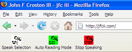
- Left button is “Speak Selection”
- Middle button is “Auto Reading Mode”
- Right button is “Stop Speaking”.
Screen Readers
Free screen reader extension for Firefox that acts like a screen reader and was created by Charles L. Chen.
Uses
- Listen to your page to see how it sounds to someone with visual issues.
- Close your eyes and listen to your website. See if you can navigate and find information. You should be able to, since you created the website.
Other Screen Readers
- JAWS - free trial (shuts off machine every 40 minutes) or $900 - $1100 to purchase with three free upgrades.
- Window-Eyes - 60 day trial $39 or $900 to purchase
Headers
Use headers - H1, H2, H3, H4, H5, and H6.
This will allow people using screen readers to skip around to the important parts of the page using key combinations.
Say-Instead Part of CSS3
The new CSS3 property called �say-instead�, is used to allow screen readers to pronounce words or phrases correctly. See example below.
Godfather II versus Godfather II
CSS
.sayinstead_godfather2 { say-instead: �The Godfather Part Two�;}
HTML
Godfather II versus <span class="sayinstead_godfather2">The Godfather II</span>
How it should be read
Godfather II versus The Godfather Part Two
I even created an example page for you to use the Fire Vox screen reader on.
Skip Nav
WebAIM article on how to implement skip navigation.
Reasons for skip nav:
- Main content is not usually the first thing on the page
- People using screen readers are forced to listen to a long lists of navigation links, sub-lists of links, and other elements before arriving at the main content.
- Keyboard users are forced to tab through all of the top links in order to reach the main content.
<div class="hide"> <a href="#MAINcontent">Skip to Main Content</a> </div>
<body>
<a href="#maincontent">Skip navigation</a>
…
<h1> <a name="maincontent" class="maincontent"></a> Heading</h1>
<p>This is the first paragraph</p>
Skip Nav - cont.
CSS
.hide a, .hide a:hover, .hide a:visited {
position: absolute;
left: 0px;
top: -500px;
width: 1px;
height: 1px;
overflow: hidden;
}
.hide a:active, .hide a:focus {
position: static;
width: auto;
height: auto;
}
Access Keys
Access keys allow people to use the keyboard instead of the mouse to perform certain functions.
Firefox. IE, Opera, and Safari each have their own way of using accesskeys.
Here is an example of three access key combinations you can use for IE:

- � ALT + S � to change to small text
- � ALT + M � to change to medium text
- � ALT + L � to change to large text
- Finally you must click or press the � Enter � button.
These key combinations are for IE to set the text sizes that you want to make the text larger or smaller based on your preferences.
Color
Color Contrast
W3C Checkpoint 2.2 - Ensure that foreground and background color combinations provide sufficient contrast when viewed by someone having color deficits or when viewed on a black and white screen.
Two colors provide good color visibility if the brightness difference and the color difference between the two colors are greater than a set range.
The rage for color brightness difference is 125. The range for color difference is 500.
Tools
- Color Contrast Tool - Jonathan Snook
- 10 Color Checkers - Roger Johansson
Color - cont.
Color Blind Checker
About Vischeck and how to show different types of color blindness.
Examples:
- Deuteranope (a form of red/green color deficit)
- Protanope (another form of red/green color deficit)
- Tritanope (a blue/yellow deficit- very rare)
Text and Font Size
The text and font size on a website can make it difficult for visual people. If the text is to small, in poor color contrast, and all jammed togther it makes sites inaccessible.
The more vertical rythme and letter spacing a page has the easier it is to read.
Items to think about:
- Size
- Color
- Leading - space between lines of text
- Kerning - character spacing
- Measure - number of character to a line (two or three alphabets)
Text and Font Size - cont.
Rich Rutter reviewed his logs and noticed the 95% of the people that visiting his website had there font size set at the default of “MEDIUM”, which is 16px.
body { font-size: 75%;} - 12px
h1 { font-size: 3em;} - 36px
h2 { font-size: 2em;} - 24px
…
h6 { font-size: 1.125em;} - 14px
p, a, li, … { font-size: 1em;} - 12px
… { line-height: 1.5em; letter-spacing: .125em;} - line height - 18px
Tables
<table summary="Employee contact information.">
<caption>Table 1: Employee Contact List</caption>
<tr>
<th id="employee">Employee Name</th>
<th id="email">E-mail</th>
<th id="phone">Phone Number</th>
</tr>
<tr>
<td headers="employee">Dude - The Big Lebowski</td>
<td headers="email">dude [at] dude [dot] com</td>
<td headers="phone">407-555-1212</td>
</tr>
</table>
Here is the table example for the code above.
There are other ways to use “TH” in Roger Johansson's article about creating accessible tables.
What makes a form accessible & useable?
- Proper thought about the function you need to perform.
- Good mark up:
- Fieldset(s)
- Legend(s)
- Labels on input fields
- Tab indexes
- Good examples of information you want in the field, meaning
- Using the right wording for the questions needing to be answered.
- Keep instructions to only enough information to explain what you want.
- Don't use marketing speak or industry jargon.
FORM
<form action=“add.asp” method=“post” name=“RequestForm” onsubmit=“return checkContactsForm(this);”>
- FORM - element establishes a form
- ACTION is the only required attribute and should always be a URI
- METHOD defaults to “get”
- NAME is depreciated; use ID instead
“onSubmit” is used to execute JavaScript to check the form fields in this example.
"GET" is basically for just getting or retrieving data, whereas "POST" may involve anything from storing data, updating data, ordering a product, or sending an e-mail. (1)
FIELDSET and LEGEND
FIELDSET - element used to group related fields
- <fieldset></fieldset>
LEGEND - element used to provide a caption for a FIELDSET
- <legend>Registration Information</legend>
FORM Controls in ‘OL’ or ‘UL’
Most people (myself included) place input field(s) in ‘P’ or “DIV’ - sensible choice (except in certain instances).
Use ‘OL’ or ‘UL’ since most forms are lists of questions or form controls any way.
<ul>
<li> Address Line 1 <input /> </li>
<li> Address Line 2 <input /> </li>
<li> City <input /> </li>
<li> State <input /> </li>
<li> Postal Code <input /> </li>
</ul>
LABEL
“LABEL” associates content with a form control, either implicit association by wrapping the “LABEL” with form control and the text explicit association
- <label>Address Line 1 <input name="address1"></label>
LABEL's “FOR” attribute is an “ID” reference to the form control
- <label for="address1">Address Line 1</label>
- <input name="address1" id="address1" />
Where should labels be? Top, Left justified, or Right justified.
Luke W. article about where labels should go.
Eye Scan article that shows data and examples of forms.
IE6 does not understand the implicit association of a label and a form field
INPUT “Text” Control
<input name="address1" id="address1" value="User Name" />
- they can even have values
<input type="password" name="address1" id="address1" value="User Name" />
- same value as above field
- type="name" - basic text input field
- type="password" - content you want encrypted
- NAME vs. ID
- NAME - for the back end
- ID - for the front end
TEXTAREA
TEXTAREA - a multiline text form control that requires “ROWS” and “COLS” attributes!
<textarea rows="10" cols="40" name="notes" id="notes" ></textarea>
rows="XX" - tells how many rows to display on page
cols="XX" - tells how many characters wide the textarea will be
DROP DOWN LIST
DROP DOWN LIST - uses the “SELECT” element
<select name="display" id="display">
<option value="Yes">Yes</option>
<option value="No" selected="selected">No</option>
<option value="NA">N/A</option>
</select>
SELECTED=“SELECTED” is used to display your choice.
Don't forget about using “<optgroup label="xyz"> </optgroup>” around other “option” elements. Not all browsers understand the <optgroup>.
TABINDEX
Use “TABINDEX” to allow people with mobility issues to move from field to field.
- <input name="address1" id="address1" tabindex="100" />
If your source order matches the way a person would tab through the page you might not need to use “TABINDEX”. Once you use tabindex you need to do it on the whole page.
SIZE and MAXLENGTH
- Use “SIZE” to show a given amount of characters.
- Use “MAXLENGTH” to only allow X number of characters.
- This will only allow people to type the same number of characters in the database field.
<input name="date" id="address1" size="20" maxlength="10" value="02/24/1963" />
Usually the MAXLENGTH field is a lot larger that the SIZE.
You could use CSS to replace the SIZE attribute.
RADIO Buttons
<fieldset class="form_choices">
<legend>Hide my information.</legend>
<label for"visible_1" >Yes</label>
<input type="radio" id="visible_1 value="Yes" checked="checked" />
<label for="visible_2" >No</label>
<input type="radio" id="visible_2" value="No" />
</fieldset>
By applying a bit of CSS in my example form you can make this look like its just a question and you choices.
CHECKBOX
<fieldset class="form_choices">
<legend>Pick all that apply.</legend>
<label for="test" >Yes</label>
<input type="checkbox" id="test" value="Yes" checked="checked" />
<label for="test" >No</label>
<input type="checkbox" id=test" value="No" />
</fieldset>
By applying a bit of CSS in my example form you can make this look like its just a question and you choices.
READONLY and DISABLED
To protect a field from being typed in or changed use:
- READONLY=“READONLY” - for text field and textarea
- DISABLED=“DISABLED” - for checkbox, radio button, and drop down list
A screen reader will skip over them, however it will still read the labels which can be confusing.
SEARCH
Need label on search box for screen readers to know what they are looking at.
Add an HREF anchor to the search results page and the form to skip all the navigation etc.
<div class="SEARCH">
<form name="Skills_Search" action="searchResults.asp#MAINCONTENT">
<label for="search2">Search</label>
<input name="search2" id="search2" title="Enter search text." />
<input type="submit" value="Search" />
</form>
</div>
To hide the visual word “Search” just add to the hide class used for the skip nav to move it off screen.
Please review the search box and search results example.
REQUIRED Fields
All form have at least one required field. You need to have your page look good and still be accessible to screen readers.
To do that we just have to add a few things to the label and a bit of CSS.
<li>
<label for="first_name"><em>Required</em>First Name</label>
<input name="first_name" id="first_name" size="25" maxlength="25" /><span class="req"> *</span>
</li>
CSS
.hide_info a, .hide_info a:hover, .hide_info a:visited, .search label, label em {
position: absolute;
…
overflow: hidden;
}
Please review the required field example.
Error Messages
<li>
<label for="first_url"><em>First</em> URL<strong class="msg2"> must start with HTTP://</strong></label>
<input name="first_url" id="first_url" size="50" maxlength="100" tabindex="4000" />
</li>
CSS
label strong.msg2 {
color: #888;
font-size: .8em;
font-style: normal;
line-height: 2.5;
position: absolute;
top: 0;
right: -33.75em;
}
Please review the error message example.
Miscellaneous
- For FORMs write clear and simple directions of what should be done and what information you are looking for.
- List all errors at once, instead of one at a time and FOCUS on first field with an error.
- Show errors early so they can be corrected right away.
- By doing a “FOCUS onLoad” you will put a screen reader in the middle of a page without any knowledge of what the form is about.
- Finally, ALT text should be written so that it provides useful alternative information about an image. Not every image needs to have text but they should all have the alt attribute.
- Example: don't do <img alt="bullet image" /> instead do <img alt="" />
Questions?
Resources
- W3C - Accessibility
- Web Content Accessibility Guidelines 1.0 - WCAG
- Section 508
- Aaron Gustafson - http://easy-reader.net/ - blog
- Aaron Gustafson - Web Visions 07 Forms Presentation
- Derek Featherstone- http://www.furtherahead.com/
- Ian Lloyd - http://lloydi.com/
- Ian Lloyd - http://www.accessify.com
- Joe Clark - http://joeclark.org/
- Joe Clark - http://fawny.org/ - blog
- Patrick Lauke - http://www.splintered.co.uk/
Resources - cont.
- Knowbility - http://www.knowbility.org/main/
- Kowbility.org - http://www.knowbility.org/curriculum/ - curriculum
- WebAIM - http://www.webaim.org/
- WebAIM - Skip Navigation - http://www.webaim.org/techniques/skipnav/
- W3Schools - Forms - http://www.w3schools.com/html/html_forms.asp
- W3 Forms Spec - http://www.w3.org/MarkUp/html-spec/html-spec_8.html
- Many SXSW 2006 and 2007 podcasts deal with accessibility
- Roger Johansson - http://www.456bereastreet.com/
- Roger Johansson - Accessible Tables
- CLiCk Speak - http://clickspeak.clcworld.net/ - useful for those with reading issues or as second language
- Fire Vox - http://firevox.clcworld.net/ - free screen reader extension for Firefox
Contact Information
“It’s only words and photos on the internet”
- E-mail - jacobboomer [at] msn [dot] com
- Twitter - http://www.twitter.com/jfc3
- Website - http://www.jfciii.com
- Blog - http://www.jfciii.com/blog
Presentation